UX Case Study
Cerebro: Crafting an Accessible Design System
Target • 2017–2020 • Lead Visual Design (Contract)
Sketch component library
Project Background
A visual language and UX guidelines for better, faster, and more consistent design
Cerebro is an internal product that leverages Target's Guest data to build custom audience segments and objective-optimized marketing campaigns.
Snapshot: Audience Dashboard UI
Snapshot: Admin Tools UI
While I began as the lead (and only) designer on the project, Cerebro quickly grew in both capabilities and team size.
A visual language was needed that allowed current and future product designers to solve challenges quickly and consistently.
The result: a design system and component library called Xavier.
Case Study Sections:
1 Grid & SpacingJump to section |
2 Color SystemJump to section |
3 TypographyJump to section |
4 UI ComponentsJump to section |
5 Design PatternsJump to section |
6 Sketch LibraryJump to section |
1 Grid & BaselineJump to section |
2 Color SystemJump to section |
3 TypographyJump to section |
4 UI ComponentsJump to section |
5 Design PatternsJump to section |
6 Sketch LibraryJump to section |
Grid & Spacing
Establishing a foundation for visual organization & cadence
The Xavier grid system is composed of 12 flexible columns with a fixed 30px gutter. Page layout can easily be customized by mixing different column sizes.
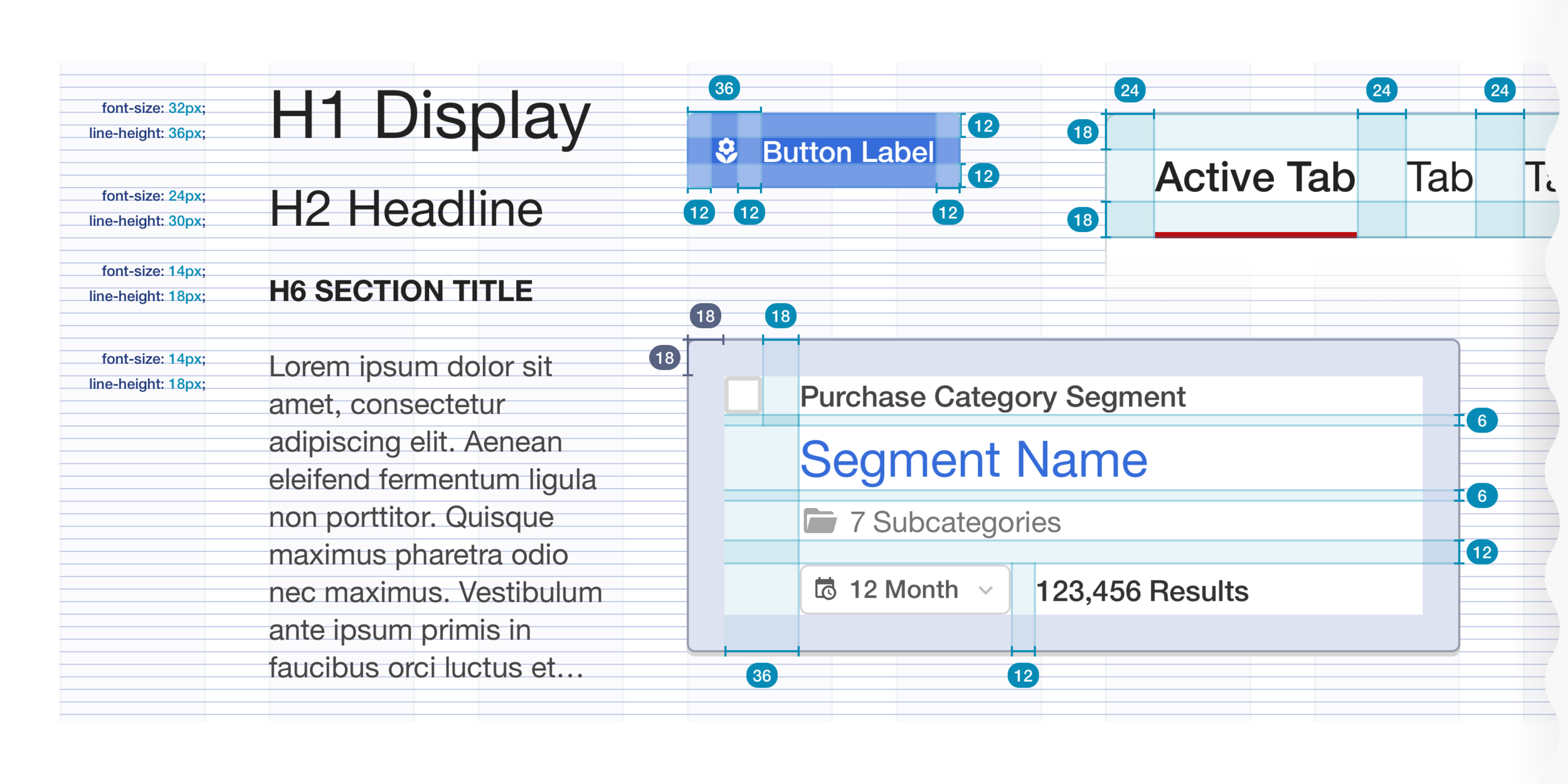
For visual rhythm, the spacing system is based on a 6pt grid, which applies to line heights as well as component padding and margins.
Grid System: 12 flexible columns allow for many layout options
Spacing System: 6-pt baseline grid
Color System
Developing a flexible & predictably accessible color palette
I defined color roles for improved UI consistency, expanded upon Target’s existing palette with a variety of tints/shades, and defined additional colors for status and data visualization.
Color System: Xavier’s full color lineup
Color Associations
The level of red saturation used for Target.com was not well-suited for Cerebro’s more complex UI requirements.
For interface consistency, 'Target Red' was assigned to navigational elements, and a vibrant blue was selected to represent primary action.
Consistent use of color for a more intuitive UI
Color Contrast
To help quickly identify acceptible contrast ratios for text/background pairings, a value from 90 (darkest) to 00 (lightest) was assigned to each color.
A difference of 50+ yields WCAG 2.0 AA contrast for standard sized text.
Accessibility tool kit: I used webaim.org to check contrast ratios
Quick Rule: Color pairings must have minimum delta (Δ) of 50
Status Colors
The notifications palette is used to provide in-app guidance and to communicate information such as the health of a campaign at a glance.
To improve accessibility, a status icon is also used wherever possible.
Target Red vs. Error Red
Finding a distinct color to communicate error messaging and/or destructive behaviors
Data Vis Palette
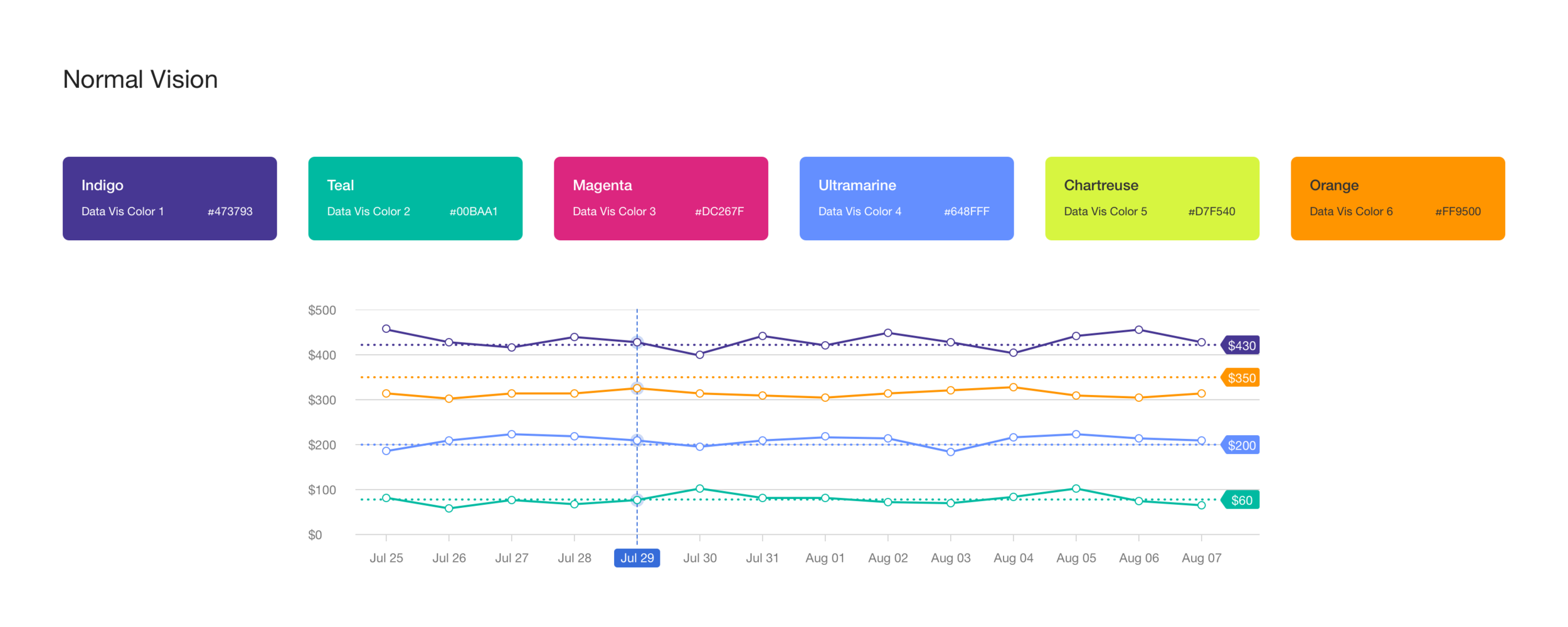
Audience and campaign metrics play a big role within Cerebro. A color-blind safe palette was developed to communicate this data clearly.


Typography
Establishing information hierarchy with consistently applied type styles
Across it's digital products, Target uses “Tarvetica,” a customized version of Helvetica Neue. For Xavier, I defined 6 heading styles and 2 paragraph sizes:
For added emphasis, any text style can be made "Strong." Additionally, eight color variants were defined to establish hierarchy and/or context:
UI Components
Combining grid, type, and color styles to create the UI building blocks
As a living design system, Xavier has grown over the years to contain an extensive number of components.
Below is a representation of just some of the elements.
Buttons
The library includes a variety of sizes and colors designed for situations like prioritizing action, distinguishing function, and alleviating action-heavy UI.
Form Fields
Form components were designed to be visually engaging and to provide context/guidance where needed.
A sampling of form elements in the Xavier system
Tables
The table components started off basic and grew over time to communicate complex data and analytics.
Some of the cell types available
Design Patterns
Page templates and guidelines to ensure a consistent user experience.
Common layouts and components for pages such as dashboards and creation forms helped create a cohesive experience throughout Cerebro.
Page Header Templates
Panel Template
Example Page Designs
Invoicing Dashboard UI
Invoice Management UI
Sketch Libary
UX'ing the component library
I used Sketch's constantly improving organizational and symbol capabilities to build a shared component library that was easy to navigate and customize.
Sketch Component Library Organization


